Monday, May 25, 2009

Font joy - Love Font


Haven't posted a font in a looooong time. This one caught my eye. I like the combination of retro and futuristic, which is quite an accomplishment.

Ingenious fixture


I'm in love with this bathroom setup. I love the entire 'drawing water from the well' metaphor the designers employed. And you can't beat the functionality of having hand towels right there.

The name of this setup is 'Canali' and the manufacturer is Neve.

Hat tip [Neve]

iPhone paintings hit critical mass


If there's any more proof needed that the iPhone has become media, the blogsphere, specifically Engadget and Gizmodo, are buzzing about the latest New Yorker cover drawn in "Brushes", the iPhone application that I've blogged about in the past.

Looks great and not unlike a 'real' work of art.


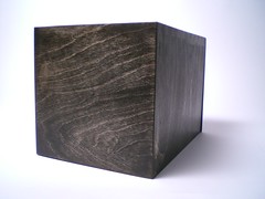
What's in the black box


mystery box closed
Originally uploaded by jbfbouchard

Usability experts Adaptive Path have a great blog that chronicles some of the issues they face in their field. I love reading it because usability is one of those topics that I find fascinating. How things work and why is one of those things that easy to learn but difficult to master.

A team at Adaptive Path went to rural India to understand how locals use mobile phones. I advise all to read it. What struck me most was that the West has a way of thinking that is related to our world and that thinking and iconography may not translate once we've left our collective "Westopia" shores.

It got me thinking about how abstracted we are from what we use. In India, the researchers noted that it is a very physical/mechanic universe. Things get reused and repurposed, meaning it can be hacked to suit the user. That is the way things USED to be back in the day but is far less true now.

Most modern cars and appliances in our home are so complex that it's impossible to repair things ourselves. That's great for the repair industry but it also decreases the attachment that we have to the things we buy.

I wonder if this is a trend that will continue or will we start to see more transparency. Such a movement is taking place with food; people increasingly want to know the source of their food. I only hope that spreads to other industries.

Let the culling begin


FineLine
Originally uploaded by FotoEdge

As most of us know by now, Chrysler is beginning to cull dealers, with many of them at the end of the line come mid June. There is a lot of hand-wringing over this decision. Socially I can see the issue but economically it's a non-issue.

The Former Big Three automakers have far more dealers than their current volume and demand supports. Much is made of the idea that this is a one-way relationship; that automakers push cars to the dealers, who have little choice in the matter. That's the basis for the suit and I think the dealers have the right to sue since they were forced into financial distress to save the company's hide. That is certainly true of the last few quarters when sales started to go south.

What is less discussed is the enormous influence dealers have on what automakers make and sell. In their markets, dealers compete with one another for those precious consumer dollars. Sometimes that competition is with others selling the same make but most of the time it's with consumers cross-shopping the same segment – e.g. car based SUVs.

If Joe Blo walks into a Ford dealer and asks if they have a competitor to Chrysler's mini van and the dealer has none, that information will be relayed back to the manufacturer. No one wants their dealers to give up sales, so automakers produce vehicles that don't really have much to add to the 'conversation' in terms of newness but show they can be competitive in a particular segment.

Everyone does it. Perhaps it's time for that to change. I think we'll see more automakers throwing their money into fewer segments but producing more competitive vehicles within those segments. Maybe bankruptcy is the best thing to happen to the US auto industry because it can finally function on a more rational basis rather than the neverland.

Sunday, May 24, 2009

Is the web communist?


Communist poster of the Statue of Liberty
Originally uploaded by shaneosullivan

Well the article actually asked if the Internet is socialist.

Wired did an article about this topic. Why? Because of the emphasis on collectivist solutions to challenges that should be capitalist. Case in point, Linux, which Bill Gates loathed with a venom replicated only by the US hatred of the Soviet Union. Open-this and that. Shared that and the other. All leads up to socialism.

Wired asked the question recently in an article called "The New Socialism: Global Collectivist Society is Coming Online." Even Facebook and the like are simply social-activist sites and tools of the proletariate.

Or not... I think in spite of the underpinings that smell of socialism, the web is still a pretty capitalistic place. Any space that can harbor a large albeit fictitious economy callled 'Second Life' can't be further from the writings of Karl Marx.

One thing I find fascinating is the "socialist leanings" of the web was born out of deficiencies in the "capitalist" IT industry. People got sick and tired of Windows' security problems and those who knew Unix longed for the reliability and security of that operating system. It become open-source because it's expensive to hire a squadron of programmers to build and maintain an OS. It was a model that seemed to have worked for Unix; many hands make work light.

For as many calls I hear for the 'data and information to be free,' I see and experience many times more schemes to get more of my hard-earned cash. And those that offer something unique and interesting get it.

What Microsoft and others critiquing the internet – I'm looking at you Sony Pictures exec who said nothing good has come out of the internet – fail to understand is that open-source attacks the weak. If your product is weak, you will die.

It's about as capitalistic as you can get.

Keep (this space) clear
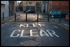

Keep (this space) clear
Originally uploaded by Briggate.com

I've completed the final part of my move – at least the NY one. I rid myself of the 95% of the moving boxes, thereby clearing space for what will be the office. Having those boxes looming over my shoulder has kept me in 'moving' status longer than I thought they would.

It's amazing how little things keep you chained to a state of being or thinking.

Paperless world?


The Paper Boy
Originally uploaded by from a second story.

I am clearing out my blogs today – spring cleaning as it were – and I happened upon an article from BrandWeek regarding the demise direct mail. The medium is declining, with forecasts predicting at nearly 40% drop in spending by 2013. That's almost $20 billion disappearing. The article mentions that for a time, direct mail was the number one marketing expenditure. This forecast predicts that it will fall to four place – under broadcast TV, radio and newspapers. Of course, in its' place will be email, already moving to the number one digital spend.

That got me to thinking about the printed word and/or image. In my lifetime, I could witness the virtual elimination of printed content. For someone who used to be a huge magazine fan, it's a shocking development. There's something reassuring about paper, namely the texture, color and infinite variety. What would happen if paper really were to disappear, as those calling for the paperless office have been eagerly awaiting?

I'm sorry to see paper go – and let's be real it won't go anywhere for a long time. But at the same time, I like the idea of a less resource dependent way of interacting with words and pictures.

That's why I took to the Kindle and that's why I embrace any solution that will be forthcoming in digitizing the magazine experience – glossy photos, intriguing headlines, ground breaking layouts, and a mix of serious and fluff pieces. The web has gone a long way to bridge the gap but I find websites too confining in that they require computers to interact with them. I just want to turn a page.

Content providers have developed iPhone apps to bridge the gap – Style.com is one – but I want something more vibrant and less power-hungry. Plenty of readers are looking to jump into this space so more soon, I'm sure.

Commentisement

Blogging has been an interesting process for me. I don't get much feedback in the way of comments but I do know I have friends reading it. Even others.

One of things that I didn't expect I'd face is what I call 'commentisement.' These are comments that are only tangentially related to the post. The sole purpose of these comments is to link to something the poster is selling.

One example is a post on living room furnishings that I did. The comment I got sent me to a luxury bedding supply store. Huh?

Note to all reading my blog. I moderate comments and do not accept commentisements.


Function over form


When Form Follows Function
Originally uploaded by
queenbeeamy

Seems I'm not the only one who noticed that furniture shows were more subdued this year. The WSJ ran an article [subscription may be required] discussing the Milan show and noted that gone are the days of iconic attention getting pieces. In its place are thoughtful, functional pieces that get their cache from craftsmanship and perfectly executed details rather than outrageous design. Personally, I'm fine with the shift.

Kitchen minimalism


In the era of the U-shaped room kitchens decked out with as many toys as can be afforded, it's interesting to understand what was considered a modern kitchen nearly a century ago. This is the Electrochef modern kitchen, designed in the 20s.

I love the functional minimalism. The surfaces are easy to clean. Everything is at the perfect height. One doesn't need to bend over to get something out of the oven. And because it is on a stand instead of taking up floor space, it's feasible to put a few pots and pans under the unit and out of the way. Interesting design.

Hat tip [Dornob]

Saturday, May 23, 2009

What I'm drinking - Corazon Reposado


One of the things that I've wanted to do is explore premium tequila. I've always been a big fan of the stuff, and not solely based upon shooters imbibed in my younger days. I worked on a tequila project a few years ago and realized the gulf between the American tequila experience and the Mexican one. I resolved recently to embrace the latter for a while and see where the journey takes me.

The American experience is usually anchored in one brand - Cuervo. Say it and everyone will have a story to tell. Usually shot related. Lime and salt is involved. If not shot related then with a sweet and sour mixer. Often frozen. The stories usually end with something tragic happening. Tragic as in told to one's friends or by one's friends over and over.

The Mexican experience is a lot more dignified, even if it may result in the same or similar ending. It's the equivalent of brandy. Designed to be sipped and savored on the veranda on a nice warm night. With summer approaching I want more Mexican and far less American.

My tequila exploration started at Temple Bar. The bartender working that night is well versed in the art of premium tequila and poured a few of his favorites. It was there that I landed upon Corazon's Reposado. It's one of the smoothest tequilas I've tasted and has a lot of flavor. I drink it both on the rocks and neat with a rind of lime on the rim. Honestly though, rocks is the best.

Here's to more of this.

Thursday, May 21, 2009

ICFF Ottoman Rugs


I love Turkish rugs but they tend to dominate any space you put them in unless the room is enormous. This happens for two reasons – the colors and the patterns.

This rug company in NY called Classic Rug Collection has come out with a line of Ottoman inspired rugs that pull and enlarge patterns and motifs from classic Turkish rugs. I got a glimpse of one but plan on investigating further soon, as their showroom is not that far from me.

ICFF Koncept LED Lamps


Now available from the MoMA design store is this LED lamp from Koncept, which comes in both table and floor heights.

I love LED lights; I have two standing ones I bought from Levenger. They consume very little power and they look great. The only thing I dislike is the fluorescent-like blue cast to the light, which is not always flattering or soothing. Koncept lamps solves that problem by offering the option of both warm and cool LED bulbs. I hope the industry standardizes on the warm bulb.

Cork


I'm in the market for a media console and this one caught my eye. The front is made of cork, which can be uniform or several colors/shapes of cork. I really like the simplicity of the construction – particularly the legs – paired with the texture and complexity of the cork. Nice piece that's on the list. It's from a Pennsylvania-based eco furniture company named Iannone.

Wednesday, May 20, 2009

Stickers


The wall stickers trend is in full swing. As a design idea, they are a great way to add visual interest to what would normally be a blank space. There were a few showing at the ICFF but there were two that I liked.

The first was from a Danish firm called Ferm-Living, their website linked here. The other was a British firm called Miss Print. Miss Print's offering called 'Muscat' is shown above. Miss Print focuses on Eames-like abstract patterns that are perfect for a mid-century modern style home. Ferm-Living has a more organic/natural eye with patterns of various flowers and trees. They even have birds, some of which are a bit too Hitchcock for me.

Both firms make many other things and for Miss Print, it wasn't their vinyl coverings that attracted me but rather a three-legged lamp shown above. Having the pattern offers visual interest without making a room too busy.

Tuesday, May 19, 2009

ICFF - overall thoughts

The next few posts will deal with the ICFF I mentioned earlier. It was a really cool experience, right off the bat. I've been excited by furniture design for a long time so it was great to immerse myself in a show on the topic, much like the NY Auto Show I attended a few weeks ago. For those who are well versed in this exhibition, pardon my layman's analysis.

All things considered, it was a pretty sedate show. In fact, it was much more sedate than expected. I thought I would see lavish displays – and there were a few – and lots of incredibly unique pieces that were more design statement than a piece of usable furniture. While there were a few of those, it wasn't the predominant theme of the show. By far, 'green' designs were the most prevalent. Green can sometimes mean bland but designers rose to the challenge and focused on simple forms and texture. Mid-century modern hasn't released its grip on design minds and it was great to see it hasn't, since it's a favorite of mine.

It is reflective of our economic times that the focus of the show was on sales. I disappointed many by saying that I wasn't an interior designer or a retail shop. On the plus side, so many vendors sold direct on their website.

I wish I had gone to the big Milan show this year. I may put it on my list of places to go next year. That and the Frankfurt Auto Show. More from the ICFF to follow soon.

Monday, May 18, 2009

Returning to normal

I'm 50% finished with my move and 100% finished the NY part of my move. The other 50% – the move of stuff long languishing in storage in San Francisco – will take a few weeks to complete but will happen sooner than later. It's amazing what a difference a new space can make in one's life. I've gone from dark and small to light and large. It's awesome.

I'll kick off the 'summer' season shortly with posts from the public day at the ICFF – International Contemporary Furniture Fair – at the Jacob Javitz Center here in NY. I've avoided my design blogs so that I can approach the show with my own lens without outside influence. It's my first ICFF show so I'm excited to see what I usually see second or third hand.

Thursday, May 14, 2009

T Minus two days

As I mentioned, posts will remain sporadic as I prepare for my move. The movers arrive on Saturday. Huzzah!

I will get the keys today. I'm beyond excited. Now I have to figure out how to smooth the transition for the doggie.

Tuesday, May 12, 2009

red head, bad temper


red head, bad temper
Originally uploaded by pvb2009

Great facial expression

iP painting 28.


iP painting 28.
Originally uploaded by SteveJohn

Love this.

The Future is Fabric

Yesterday's WSJ [paid link] had an article about changes in men's fashion, namely the increased emphasis on new fabrics/materials and forms. One of the items discussed I have blogged about before – Calvin Klein's foam coat that's due out in July.

This is a topic that is close to my heart due to a recent purchase of a jacket from the NY/Soho label – DDC Labs. NY's weather has a habit of exposing gaps in one's wardrobe and this year is no exception. I have lacked a mid to lightweight coat. Now given my austerity this year, it's not a gap I've been rushing to fill but it is something I've needed to get.

I picked up this really cool hoodie made from Polyester, Polyethylene, Lycra and Nylon. DDC calls it climate control as the jacket breathes and regulates the body temperature. They say it has a 20 degree effective range and it does in my opinion. It's incredibly comfortable and hugs the body.

DDC specializes in interesting materials such as bamboo and aluminum. They are worth a look for interesting and functional pieces.


iPhone as canvas


I think I've written about Brushes, one of the amazing 'paint' applications available for the iPhone. The Flickr feed is outstanding if you haven't seen it.

The UK's Daily Mail did an article on David Hockney, one of the UK's outstanding artist. Now in his 70s, he has taken to the iPhone like a duck to water. He's given it a little easel and 'paints.'

Core to Apple's success has been the artist. It's great to see that enthusiasm channeled to the iPhone.

Hat tip [Towleroad]

information overload

I'm using the iPhone for this entry. A program called iBlogger, I think.

Ironic to be using tech to talk about tech overload. I am delisting today. Well not in general.

I took to RSS feeds like a duck to water. I have hundreds of feeds that I follow. Of at least have in the past. Today I am going to get rid of a lot of them. I just don't have the time to spend plowing through them. I'm looking forward to the winnowing process.

Ah the smell of feedom.

Monday, May 11, 2009

Flexi lamp


Filed under 'when and how much' a flexible lamp designed by a Spanish design studio. Love. Check out the link for more details.

Hat tip [Design Spotter]

Sunrise sunset

I wonder if there's a term for this. In winter, there's SAD, that sunlight deficiency depression thingie that makes Nordics drink too much and off themselves.

For me, summertime brings extreme light sensitivity. For the last few weeks, I've been waking up with the sunrise. Almost on the dot. It's eery and really frustrating because I'm not getting enough sleep. And I don't even have direct sunlight in my apartment!

I'll be moving at the end of the week to a new place and the first thing I'm going to invest in is sun-blocking drapes. Until then, grrrr.

Sunday, May 10, 2009

Stunning chandelier


Launched at the Milan Design Week a few weeks ago, Hope by Francisco Gomez Paz and Paolo Rizzatto.

Hope is a pendant light that could be defined as an innovative interpretation of traditional chandeliers. Both use hundreds of crystal pieces that multiply and diffuse the light.

It's light and easy to assemble. I think I see 'Hope' in my future.

Hat tip [Moco Loco]

Friday, May 8, 2009

Bento for iPhone


Bento is Apple's consumer database application. It's one of those applications that I purchased some time ago but just hadn't used much to date. It resides on my desktop, limiting its' utility in places I need it the most – everywhere else. I've tried other applications as semi-databases – namely Evernote. Evernote is a great app but it's PIM functionality is limited, making it difficult to process stuff that I have captured.

Then earlier this week, the pieces came together in the form of an iPhone app – Bento for iPhone. Designed to be used as both a stand-alone and in conjunction with Bento for Mac, the application is the epitome of simplicity and utility that one expects with Apple. It's loaded with pre-designed templates for a range of uses, including project management, list management, a recipe database, media database and more. Syncing is effortless. I'm really looking forward to seeing how it will improve my life in the months ahead. I do know I feel more organized already.

My only frustration – and it is a big one – is the inexcusable inability to sync iCal Tasks, one of the best parts about Bento. This feeds into a much larger irritation – the horrendous approach to task management on the iPhone. Simply put, you can sync iCal reminders but that's it. You can't manipulate those tasks on the phone. This is even more frustrating because Apple made a big deal about tasks when they released Leopard – specifically the ability to pull to-dos and notes from Mail messages quickly and easily. The iPhone OS 3.0 finally syncs notes but tasks are still MIA. WHY?! Having to use a third-party application to manage my task list is incredibly frustrating because it exists outside of my dominant workflow.

I'm off my soapbox. I'm probably going to continue grumbling about it until it appears. Hopefully soon.

Moving House


Day 12 - Moving House
Originally uploaded by kaz2803

Postings will be sporadic over the next two to three weeks. I'm moving into a much larger space and will be pretty consumed with sorting out my apartment. There will be a lot of picture postings ahead as I explore the new area. Very exciting!

Tuesday, May 5, 2009

Ten Degrees


IMG_0463
Originally uploaded by mitchsfo

Next in the "restaurants and bars I've been spending too much time in" series.

A stylistic representation of 'Ten Degrees' on St. Marks and Ave A in the East Village. Great place run by a guy name Moti from Puerto Rico. I've never been to PR but if this bar is anything like the island, I need to go.

Sitting, Waiting, Wishing


Sitting, Waiting, Wishing
Originally uploaded by Silvia de Luque

I am like this man at the moment. I'm in a state of paralysis in many ways.

I'm waiting on three different things – the chance of a new apartment and a completely new way to interact with the city, a project that has been in the decision making process for ages and payment from a client. There are other things I'm waiting for but those are the big three.

It's really scary to be hanging by a thread, as it were.

But it's better than no momentum at all.

Time measure clock


This is a very cool clock concept called the 'Measure Wall Clock' by Burak Kaynak. I love the wall reference to Tadeo Ando, one of my favorite Japanese architects. I also love the description by the designer most of all. I hope this gets produced.

"Time is linear, so can you measure it ?

It's a wall clock / inspired by the measuring tape rotation / a winding device for winding a measuring tape into its housing by the action of a winding spring.

It shows the time just like a measuring tape, has a central red line is fixed in position whilst the numbers move from right to left and left to right that indicates the time on a scale of 0 to 23. Additional part moves in and out automatically from the housing.

The minutes are shown in a line group / 10 minutes...

Web apps

I'm not the best at admin stuff so I reach out to technology whenever possible to lighten the load.

I've been using a service called Shoeboxed.com. Why? I had a stack of receipts two feet deep that I needed to process for my taxes.

It's a pretty straight forward service. You sign up. They send you special envelopes. You stuff them – well neatly – into the envelope and mail it off. When they receive it, they scan them and use OCR to read the amount and the vendor. They put all of that information online for you to categorize, export etc.

The service itself is great. The website is the weakest link. The site is very slow sometimes, which if frustrating if you are trying to categorize a lot of receipts. If you click on a link accidentally, you are sent to a new page. If you are trying to process a batch of receipts and have gotten the information presented in a useful way, this new page behavior slows everything down.

This is the problem I have had with Jott, the transcriber service I mentioned some time ago. I got into the habit of telling it everything that I wanted to do. Trouble is, putting this data dump into a logical structure was incredibly difficult. It improved with their new iPhone application but by that time, the list was going to take me a long time to categorize well. Their local client – using Adobe Air – actually performed worse than the web app, in my opinion.

For all of the hoopla about web applications – and I do like them – sometimes a local client makes a task so much faster to execute.

Moving?

I've been angst ridden while I search for a new apartment. As much as I love my neighborhood, it's a bit difficult to live in a tourist paradise. At some point in time you just want to say – get off my lawn!

Saturday, May 2, 2009

Mockup of Apple Tablet


As Apple's WWDC conference in June approaches, the rumor and mockup mill is in full force. I like this artist idea of what one would look like. I doubt Apple would come up with anything like this but it's still a great idea that I would run out and get.

Update: This is so unlikely from an industrial design standpoint. I doubt Apple would stay with the iPhone design given the role of a tablet is so different than the role of a phone.